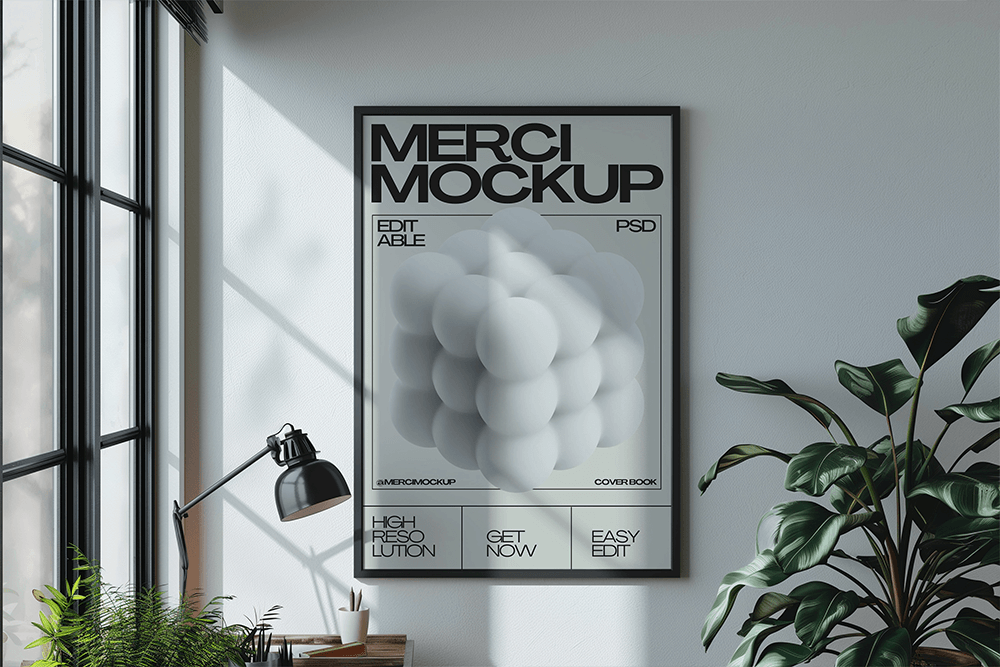
Mockups, as is well known, have evolved into a powerful tool for designers to present an appealing and accurate representation of their work. Mockups are a great method to show off a brand, package design, website layout, or even a garment idea before the actual thing is created. Despite the apparent simplicity of mockups, many designers often commit errors that diminish their quality and impact their presentation.


In order to make sure that clients are impressed by the use of mockups, here are five common blunders that designers do.
1. You should avoid using a low-quality mockup since it will ruin your design’s image, make it appear blurry and low-resolution, and prevent you from displaying the design properly, giving it an unprofessional appearance.
Preventing It:
Make Sure It’s High Resolution: If you’re working with a print-based design that requires extremely sharp photos to see the text legibly, make sure the mockup you choose has a minimum resolution of 300 DPI.
Verify Compatibility: Verify that the PSD or AI format of the mockup file is compatible with popular software like Adobe Photoshop and Adobe Illustrator.
2. Designers that don’t employ smart objects in their Photoshop mockups frequently make the mistake of not properly layering their elements. They just placed the design on top of the smart layer without properly pasting it, leading to poor alignment and an unnatural appearance.

Solution to prevent this:
Mastering the use of smart objects is essential: Typically, mockups already have a smart object layer specified. You may easily add your design to the prototype by double-clicking on that layer, dragging and dropping it, and then clicking “Save.”
3. Selecting an implausible setting
Putting your design in an impractical or inappropriate location can only lead to client confusion, so avoid this pitfall. As an example, showcasing your company’s card design in a setting like a forest is both unprofessional and totally out of place.
Solution to prevent this:
Pick an appropriate setting: A simple, sophisticated mockup is perfect for high-end perfume brands. A vibrant mockup with lots of colors can give children’s products a more lively appearance. Stay away from busy backdrops: Clients will be confused if the backgrounds distract from the main object of your design.
4. Color, shadow, and lighting are not customizable.
In order to make the mockup feel more realistic and in line with the brand’s concept, you need to adjust the lighting and shadows. This isn’t easy, but there are tutorials on YouTube that may help you master the technique.
5. Cramming too many aspects into the design
Since design is an exacting process, you must be exact and adhere to the brand’s style guidelines; otherwise, you risk overwhelming the client with too many objects or elements. The client becomes confused, and the presentation suffers as a result.
how not to do it:
Stay minimalistic; don’t use too many branding components and stick to a single design idea at a time.
And these are five common blunders that designers make while working with mockups. To sum up, designers may really step up their game when they use mockups to create a polished presentation. BUT, as previously said, you risk losing the client’s trust if you make errors.
If you have any comments, suggestions, or critiques, please do so below.
